Hello, I've been wanting to share my Masters entries on my blog for ages
but never seen to find time to squeeze it in.
I thought I might do a series of posts over the next few weeks and basically go through the
techniques, planning and just my general thoughts on the layouts I created.
They may not be the most regular series of posts but I shall endeavour to get one done each week over the next month.
............................
Being a fairly methodical person I started at the first challenge and worked my way through them.
So the criteria was to -
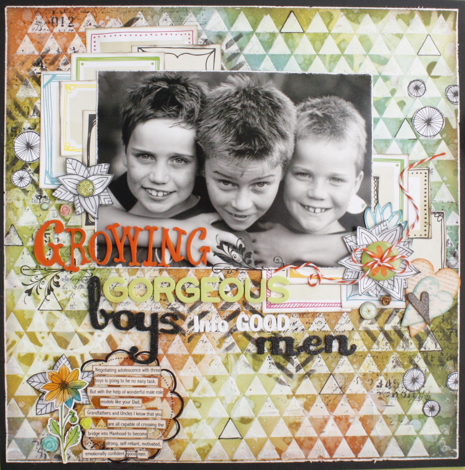
"Create a single layout using a 5x7" photo that must be engaging and have eye contact."
Choosing my photo was easy I took this photo of the boys about six months earlier and has been a favourite since, it checked all the criteria for me.
I printed it in Black and White and a colour version. In the end though the B&W won out
over the colour because of the colourful background.
I decided half way through creating my projects that I probably should take some
photo's at different stages. so I don't have too many with this first one
but there are more for the other projects.
So here's a close up of the background which I created with gesso and a Crafters Workshop stencil.
Once the gesso was dry I used distress inks to add the colour in a very random fashion.
I then used a Tim Holtz mask and the spritz/flick water method on the ink which added the water mark
effect you may be able to see.
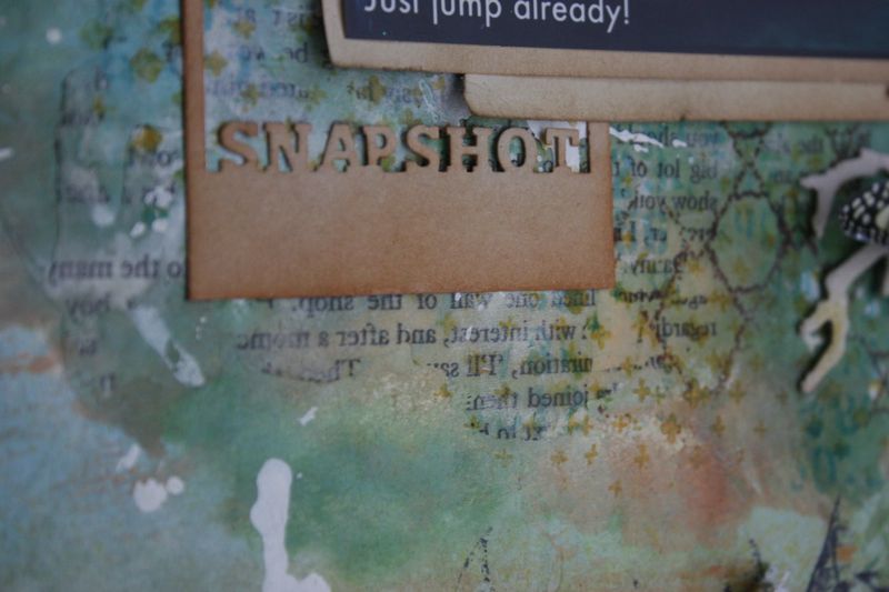
I also used another TCW template in black ink and stamps to add more texture to the layout.
Here's another picture taken midway through.
Even though my backgrounds are often heavily patterned and coloured I still
like to use some patterned paper. Who wouldn't with so much and such gorgeous designs and ranges out there? This can be a problem at times though finding something that will match the background I've created. I ended up using the Amy Tangerine Sketchbook papers which are a favourite.
The centre of the frames was plain so it actually helped to break up the background before your eyes
hit the photo.
My Title and Journalling.
Often the hardest part for me. I had an idea of the message I wanted to convey to my three growing boys. If you have boys I don't know if you feel the same but
I often feel the weight of responsibility I have in somehow producing a Man that has
all these wonderful qualities. One that is caring and sensitive yet strong, independent and motivated,
emotionally confident and reliable. They are growing so fast and I feel time is against me sometimes
with them rapidly approaching adolescence it's going to be a scary, roller coaster ride I'm sure!
Anyhow I pulled out a book I'd read years ago 'He'll Be OK' by Celia Lashlie.
I re-read passages of it and then just sat down and wrote all my thoughts down in a notebook.
The subtitle of the book was 'growing gorgeous boys into good men'.
I knew straight away it fitted perfectly with my thoughts.
So down it went using a mix of Alpha's. Because it was a long title I find using different alphas
help to highlight certain words.
My journalling which I had summarised from the notes I'd made and
printed out. I backed it onto this Little Yellow Bicycle transparent journalling spot.
The flower is from the Amy Tangerine Sketchbook range aswell.
The resin roses are from my favourite online embellishment store
A close up here of more of the embellishments.
Three hearts layered on top of each other, one for each of my boys. ;)
The canvas hearts are from
I made the flower out of leaves fussy cut from more of the 'Sketchbook' paper range.
You can see I've created a second smaller flower the same to the left of the photo and also adding some leaves to the cluster near my journalling. These three separate clusters created the visual triangle I try to use in all my layouts.
Lastly I backed the whole layout onto black cardstock to add a border which I thought just
finished things off nicely. It also helps to stabilise and flatten out the paper thats been gesso'd and stamped and inked.
You can imagine it was quite warped by the end!
So that was my first task done and dusted and I was really happy with how it evolved and turned out.
I hope you've enjoyed taking a look at the close-ups and at the processes I used to create this layout.
Next up was the canvas!
Thanks for stopping by
I'll get busy with the next post and hopefully share sometime next week.
Cheers.