Hi I'm here to share my final project for my masters entry. A little later than I intended but I've been off enjoying some time with the family on a little camping adventure.
So the last project was to scrap a Double layout that reflects on your childhood. I very rarely scrap doubles these days like never! So I was a little apprehensive approaching this one but was very happy with the end result.
Thankfully my mum loves photo's and managed to capture many, many photo's of myself and my three sisters growing up. Mum has scanned all of her old slides so they were all in digital format ready for me to edit and print however I wished.
So I wasn't stuck with only a couple of pictures to choose from but rather hundreds, which proved a problem in itself. I had trouble narrowing it down to just a few photo's, so what did I end up doing? Well I put at least ninety photo's on my double!
Here's the end result.
I didn't try to add that many photo's from the start it sort of just happened!
I drew a few sketches of potential layouts and then played around with a lot of photo's that I already had printed just to see what they looked like.
Here are a few options I tried
You can see the final design starting to take shape about here.
But the larger photo's weren't really making much of an impact.
That's when I decided to make the smaller photo's black and white and leave the larger pictures coloured.
I created a collage in Picasa and printed the photo's on 6x4 photo paper so each of the smaller pics is about 2.5 x 3.5cm
Sorry about the blurry iphone pic!
It took forever to cut them all up and them lay them out.
And I went through the process of laying them all out several times. The first time I wasn't happy with the background (below) so it was back to the drawing board.
I used the Crafters Workshop cubist stencil because all the squares reflected the look I was trying to achieve with all the photo's.
I was much happier with this background, using white Mister Huey's ink spray.
Then it was just he journalling and embellishing.
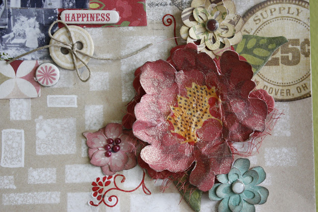
I fussy cut and layered flowers from an Echo Park paper range and also cut some flowers and layered them with the Cricut machine.
Gauze, liquid pearls and some brads, to finish things off.
Oh and texture stamps around the edges of the photo collages. I also raised the main photo's with chipboard and foam tape to make more of an impact.
So there you have it, all my masters projects. I packaged them all up and posted them off. Fingers crossed and hoping but not really expecting anything.
What a wonderful year it's been so far, receiving THAT phone call (or in my case making that call, because I missed the first one and answered a message left on my phone). LOL. The amazing amount of prizes and meeting and getting to know more fabulous people in this industry.
A huge thanks to Scrapbooking Memories magazine and it's editors for holding this annual competition and all the very generous sponsors.
I feel very luck and blessed.
Cheers,
Leonie.


This is most definitely my favourite part of your stunning entry. Thanks for sharing the process behind it too, very interesting :).
ReplyDeleteWhat an amazing project. Love how you created the dobble LO using photso in the back ground. It must have been soooo time consuming. Absolutely loveing it!!!
ReplyDeleteLeonie wow I just love your double layout :) what a great idea to use lots of black & white photos really makes the colours one pop!
ReplyDeletewhat a great layout. I love all the little black and white photos. You are so lucky to have so many. I think I only have 2 photos with me and my brothers.
ReplyDeleteYes it does sound like an amazing and fun year for each master, so enjoy! This double is amazing, so many photos, love the back ground details and the way you filled it all in!! definitely a master - piece!!
ReplyDeleteWow this is just fantastic Leonie. I would never be able to do this and you truly mastered it!!!
ReplyDeleteSo amazing, Leonie!!!! :D
ReplyDeleteWow, love seeing how your layouts come about, Leonie. This one looks brilliant...the fact that you have so many photos on there is mind blowing...LOL. Awesome work & no wonder you were chosen as one of this years Masters!!
ReplyDeleteWow Leonie that's so awesome, what a great idea! I reckon 90 photos has got to be a record!
ReplyDeleteThis is just so totally amazingly awesome. I looooove those pics and the final design is perfect.
ReplyDeleteFlipping amaaaaayzing!! You never fail to astound me with not only your artistic talent & technical skill but also your heartfelt soul that goes into your pages. For me that is too important to be left out & so often missing on some great artistic pages. Not yours!!
ReplyDeleteLOVE your post above this. Amazing layouts & great colours for 2Crafty! You do brilliant things for them. Tried 3 times but the comments on that post are not clickable?!? So can't leave a comment there...
ReplyDeleteThanks for you comments Helen, and thanks for the heads up about the comments malfunction. You're right, not sure whats happening there. :S
DeleteI have found so much inspiration on your blog. My goodness you are an industrious person. Your pages are very impressive. Love, love the gear page too.
ReplyDeleteI love reading your stories Leonie. I adore this layout - you really should do more doubles!
ReplyDeletePS - I couldn;t comment on the above post either but had to tell you how much I love your use of orange! And how cute is Trixie?!
ReplyDelete