Hi all, I've just spent an awesome weekend at the 'Savvy Delights Retreat' in Tahmoor, New South Wales this past weekend. I had such a lovely time meeting a heap of wonderfully talented, friendly funny, scrappy people.
I managed to get fifteen layouts completed and I can't wait to share them but....
I still haven't managed to replace that broken SD card so I can't photograph them, grrrr.
Until I get just one spare minute to buy another (crazy busily trying to get things done before school holidays start), I thought I would share my September post from the 2Crafty Blog.
.....................................
Hello, welcome to a new week of inspiration on the 2Crafty blog.
I have a nice bright layout to begin with today called '7'

Here's a little how to pictorial collage of the process I used to create my rainbow banner
using this cute little butterfly banner.
1. Versa colour inks were used to colour and blend half of each butterfly.
2. Each butterfly was then painted with Ranger Crackle Accents.
3. Whilst drying with the heat gun I sprayed them with Iridescent Gold Glimmer Mist.
4. A swipe of Pinecone Vera colour ink around the edge of each butterfly and there you have it!

This chipboard numeral is from the 'Everyday Font' 12x12 Alphabet sheet.
More Crackle Accents after a coating of black paint.

This tree is part of the Retro Tree pack.
I've covered the tree in patterned paper and added texture stamps and then
a very thin coat of Crackle Accents. For the trunk of the tree I used distress
markers to colour and shade.

On to my next layout.

Heidi's Vines -I love this pack!
These would have to make the list of my favourite 2Crafty pieces
although the list is getting quite large!
I just used my finger to dab on some texture paste, a bit messy but it
gives nice little ridges and peaks and adds great texture to
the chipboard.
Once dry I swiped a 'bark' coloured ink pad over it and
this highlights the ridges and peaks.

I used the same technique on these butterflies which I layered with some
canvas butterflies to make them stand out more.

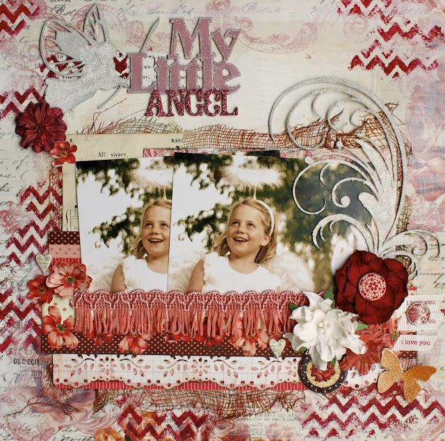
And my third layout today- My Little Angel

I used the My Little Fairy graphic wordlet on this layout
but as my Daughter was dressed as an Angel I cut the word fairy off
and added the word angel instead.
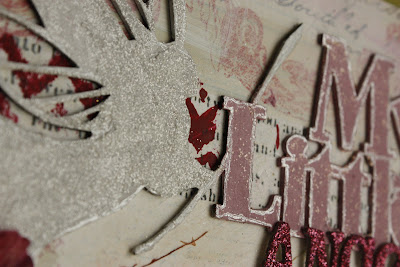
I painted the title pink, then added some stickles and outlined it with a
silver pen.

The angel/fairy and this elegant Felicity Flourish were both given a
coat of glue and then sprinkled with white glitter!

Thanks so much for stopping by the 2Crafty blog today, I hope
some of these techniques have inspired you to pull out some of
that chipboard stash or better yet get your hands on some of the gorgeous 2Crafty pieces
I've used here and use them on your own scrappy layout.
cheers. :)
Leonie Neal-Dawson

Oh wow. You really are the Master of Backgrounds. Love love. Your use of colours in each is just awesome too. 15 pages, you go girl. Cannot wait to spy them all. I am sure they will be as good as this display.
ReplyDeleteOh my! I was going to comment on the first layout but then there were 2 more stunning layouts! They are all so beautiful Leonie! xx
ReplyDeleteVery gorgeous work indeed Leonie! Mixed media heaven!!
ReplyDeleteGorgeous layouts!!! I always love your backgrounds!
ReplyDelete